If great design, as defined by the author Alan Wheeler, is “intelligence made visible,” then truly heinous design is the visual and informational equivalent of walking into a glass sliding door, at full force, in front of a room full of people. One of the loudest voices at your disposal in transmitting a marketing message lies in the (hopefully) capable hands of your design team, and they could make or break the efficacy of the message you’re trying to convey.
Not everyone is a natural visual virtuoso; that is why we employ such talented creatives to carry our sentiments into tangible, legible design output. But like all humans, designers can be fallible – and drastic design fails occur often and publicly. These fails are generally pretty funny too (if maybe not for the marketing team behind them.)
The FGX team took a look at some of the “hall-of-famers” of oft-made design mess-ups, and found some of the cringiest examples of an “oops” in action, so you can learn from other brands’ mistakes and steer clear of the less-than-lovely liability that arises from bad design. You’re welcome for the info, and we’re sorry (kinda) for what you’re about to see.
4 Common Mistakes Designers Make In Marketing Content
1. Misuse of typography
The way your graphic designer treat letters as graphic forms is incredibly important. Imagine, for example, the phrase “luck of the Irish,” but written with a few too many flourishes around the letter “L,” and how deeply awkward that signage might make a St Patrick’s Day celebration. You get the picture. Typography can be the most communicative tool in a designer’s arsenal if used intelligently, but can also entirely skew the messaging of a piece of content if mishandled. It’s imperative that a designer is knowledgeable about typeface anatomy, type classifications, type hierarchy, and composition. Their attention to detail and level of understanding of the software they’re working with, is critical in getting the text to do the thing, and a healthy attitude towards experimentation and innovation can make even the most copy-heavy piece of content feel dynamic, legible and engaging.
2. Inappropriate colour choices
Every colour and hue carries with it a distinct emotive and expressive value. We’re not talking about that deeply frustrating feeling that three red robots in a row give you, either. Correct colour usage can subconsciously enhance the relatability and relevance of the message your brand is looking to convey. It can also foster brand recognition and affection without overtly yelling “look at me! Love me!”
Conversely, inappropriate colour choices can be jarring, dissonant and downright unpleasant for the viewer. For your designer to communicate effectively, they need to be able to understand colour theory, build colour palettes, engage efficiently with colour tools such as Adobe Color, Color Hunt, or Paletton, and collaborate with your conceptual team to truly understand what you want your brand to say.
3. Confusing visual hierarchy
Perhaps all the information you’d like to convey is of equal importance – but some might be more equal than the rest. Orwellianisms aside, visual hierarchy is critical in successful design communication. Though you want your content to transmit all the information available, it’s important to be able to visually highlight the info your audience needs to internalise first, and needs to remember the most.
Consider an event poster, for example. Though it’s great news that there will be a raffle and face painting at your event, people have short attention spans, so you need to communicate the what, where and when of what you’re hosting first, or nobody’s going to arrive on the day. Designers can establish visual hierarchy through size and scale, additive visual elements, colour and typography choices, and applying grid composition principles.
Our rule of thumb is that if you can’t immediately point out the most critical piece of info in a piece of designed content, it’s back to the drawing board. Imagine your typical audience member has the attention span of a goldfish and cater your presentation of information to them.
4. Cluttered layout and lack of white space
There are very few occasions in which a packed crowd is appealing to most people over the age of 25. Maybe, at a push, it’s great at the one rave we decide to go to every three years. Or maybe when it’s a queue of people rushing to pay our outstanding invoices. Those are the only two examples we can think of. The same principles of “overcrowding” apply to designed content, too.
An overcluttered or overcrowded design that forgoes use of negative space has a similarly daunting effect to an overly-full room. Designs that don’t properly demonstrate a use of negative space present difficulty in processing information, poor readability, significant visual confusion, and a lowered aesthetic appeal. Unless the aesthetic you’re going for is “primary school bake sale,” let your content breathe and flow by leaving some room for your audience’s eyes to rest a moment.
Examples Of Drastic Marketing Design Fails
Tropicana’s Packaging Redesign
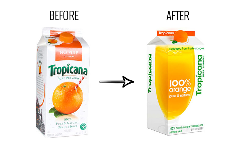
In 2009, beloved fruit juice brand and breakfast staple Tropicana redesigned its carton, dropping a whopping $35 million on the new packaging and an advertising campaign to match. The public’s reception to this redesign was, to put it mildly, less than stellar. The purchasing public detested the new design so much, in fact, that sales of the altered products dropped by 20% within 3 months, leading the company to revert their packaging back to its original state after the whole costly exercise.
Consumers saw the new imagery as “ugly,” “confusing,” and reminiscent of a “low-end grocery store brand” rather than the Tropicana they had come to know and love in the mornings. While the previous packaging was evocative, distinctive and legible, the newly designed packaging was more abstract, generic and confusing, especially when view “head on” in shelves. What can we learn from this? Well, if it’s not broken, don’t fix it. Loyal customers are loyal for a reason, and losing their favour to follow a trend isn’t going to help your bottom line. Don’t let the “Scandi Minimalism” Instagram Reels lead you astray.
The London 2012 Olympics Logo
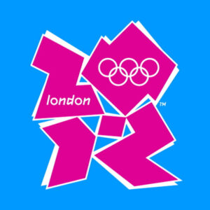
Pretend you hadn’t just read the sub-heading for a moment. What would you say that pink and blue thingy pictured above is? Our first guesses are “jigsaw puzzle manufactured in an unlit underground room,” “marking pattern on a disco giraffe,” and, simply, “blocks?” This logo for the 2012 Olympics had a similar bewildering effect on its intended audience when it was first unveiled. Firstly, with the exception of the inclusion of the Olympic Rings in the top right, which feel like an afterthought, this imagery doesn’t read as recognizably “Olympian” at all.
This logo also fails to capture the spirit of London, as its garishly 80’s aesthetic appears to have no ties to the slick, contemporary London lifestyle espoused by locals. It also, according to some dubiously observant Twitter users, looks a tad like Lisa Simpson doing some… er… questionable deeds. This logo is not legible, it’s not relevant to the legacy of the event, and though bold, it’s not recognizably affiliated with one of the most globally loved brands in sports. So – flop.
American Airlines’ New Livery
Even though we think it would be exponentially cooler going to the airport if they did, airlines don’t tend towards extravagant and obscure branding – a la flames down the sides of planes and heavy metal riffs upon take-off and landing. This is our reality, albeit a disappointing one. That being said, just because design needs to be understated, doesn’t mean it needs to be overly simple or “on the nose.”
When American Airlines revealed their livery and logo redesign in 2013, which featured replacing the “tail” logo with an incredibly large and obvious American flag, many frequent flyers were disappointed by how silly it looked. Surely an entire million-dollar marketing team could come up with something better than “AMERICAN airlines = AMERICAN flag,” right? The livery change was seen as unnecessary, playing into the overly patriotic American stereotype, and a garish eyesore. Just because a design solution is your first thought, doesn’t mean it’s the right thought. At least put an eagle on there or something.
Bing tried to “verb” itself
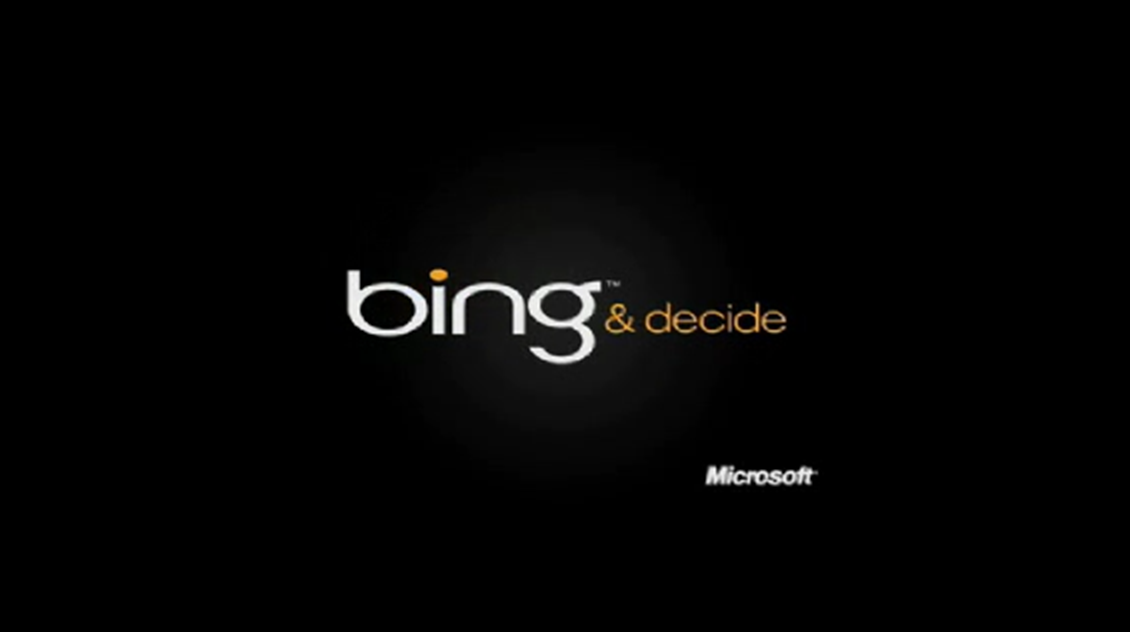
Stop trying to make Bing happen so hard, Microsoft. This is not the way! This 2010 “Bing and decide” campaign, from concept to visual execution, was the epitome of marketing cringe. In an attempt to “verb” the word Bing, similarly to the way the word “Google” has entered the popular lexicon as the act of looking something up, Bing’s marketers essentially just copied an idea.
On top of the awkward phrasing the campaign presents, visually, this information is handed to us as a demand rather than suggested to the audience through clever inference. It’s not exciting or innovative to look at, and it’s instructing the viewer to change their digital consumption habits rather than luring them to a new way of doing things by offering a point of difference. It’s clumsy, a little boring, and even comes across as slightly forceful if you’re feeling particularly sensitive.
Thankfully, Bing pivoted their strategy and started leaning in to their point of difference as of 2023. If you want to take a look for yourself, they’ve integrated artificial intelligence search functionality with CHatGPT software, to make the process of finding information way more conversational than the user experience with Google. Here’s how to try out this new type of searching.
The unnerving, eldritch nightmare that is Gritty
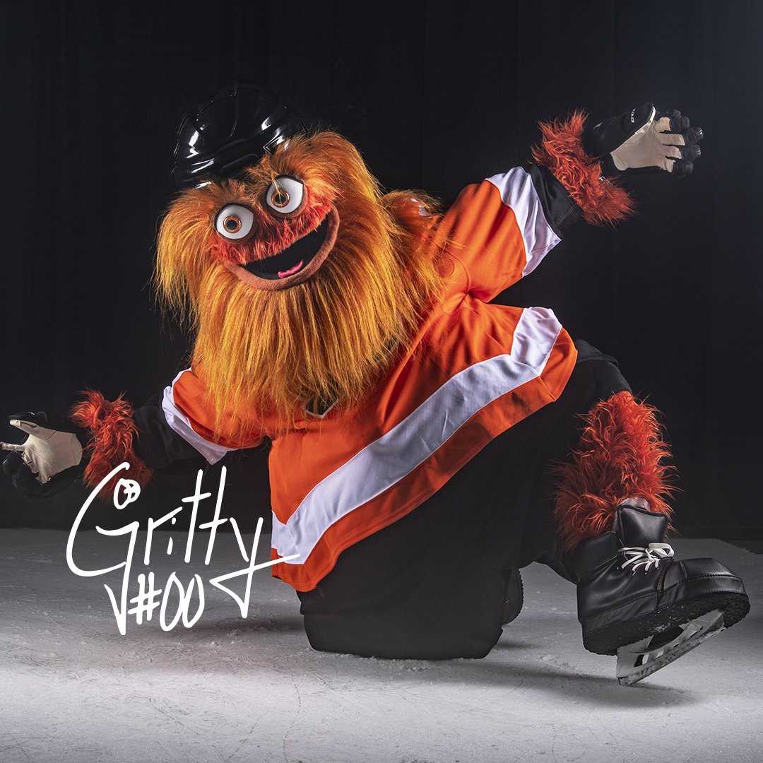
You know what? We don’t hate Gritty. Does he make us feel unnerved, unsettled, on-edge and hyper-aware of our mortality as he stares, unblinking, through those bulbous orange eyes? Certainly. But is he memorable? Yes, almost too much so.
Gritty, the official mascot for the Philadelphia Flyers National Hockey League team, is a textbook example of turning what appears to be a design fail into a viral design win. Launched in 2018, this objectively terrifying mascot was skyrocketed to infamy by social media users, who all raised their digital voices in a collective cry of “what in the everloving f**k is that thing?!”
Rather than scrapping the idea and going back to the drawing board, the marketing team behind this creature leaned into the meme, and gave Gritty the bombastic personality to match his gnarly physique. According to an official press release on the matter “the Flyers organisation wanted Gritty to have a rather intimidating appearance, as ‘someone you’d high-five but not hug.’” We’d probably do neither. Gritty has leaned so far into the meme that he’s got is own delightfully chaotic Twitter account, in which we’re pretty sure he’s assaulting hockey fans, who appear to really love it. Is this a visual design fail? Yeah, probably. But is it a FAIL-fail? No way. That’s burned into our retinas now.
Bad Design Does More Than Make Your Brand Forgettable…
It can actually make your messaging downright unlikeable. Visual communication can be a tricky space to navigate when you’re not an expert on the ins-and-outs of what endears content to your audience. Especially in digital spaces, where brand sentiment can radically change at the drop of a hat, it’s imperative that you use design wisely and efficiently.
We know it can be challenging to make consistently creative, correct visual choices that lead to conversions. That’s why here at FGX, we’re excited to step in and do that for you. Our team of expert in-house designers have the wits, the know-how and the talent to transform your brand’s vision, mission and values into cohesive, purposeful content that leads to consumer action.
If you’d like to find out more about how we can make you look damn good, damn fast, and damn consistently – schedule a call with our team today! Damn!


