Digital language
A semicolon and a less-than sign.
Kudusure / Brand identity / Insurtech
KuduSure needed a visual identity for an insurance technology proposition centred on brokers. FGX developed a mark drawn from code and showed how the identity could work across business, social and merchandise concepts.
Application concepts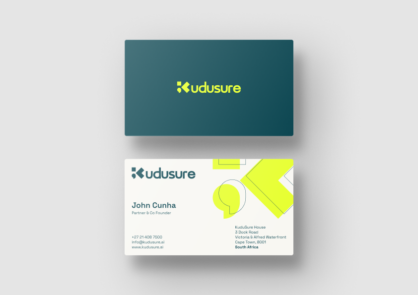
01 / The challenge
KuduSure’s stated ambition is to use AI to simplify compliance, support brokers’ everyday operations and turn complex information into useful insights. The intended benefit is more room for brokers to focus on their clients.
For the identity, that created two connected priorities: express the business’s technology focus and keep the people it intends to serve in view. FGX brought those priorities into a visual direction that could carry beyond a logo.
02 / A clear direction
An ambition to make complex information useful.
More room for brokers to focus on clients.
03 / The language of technology
FGX combined a semicolon and a less-than sign to form a stylised K. The punctuation gives the symbol a direct link to code and markup, connecting the visual identity to the business’s technical proposition.
Deep teal and vivid lime define the palette. Enlarged fragments of the symbol become graphic shapes, giving layouts a recognisable connection to the mark even when the full logo is not the main feature.
A semicolon and a less-than sign.
Deep teal and vivid lime.
Enlarged fragments of the symbol.
04 / A brand built to show up
The business-card mockup shows the identity at two scales: a compact logo on one face and larger graphic forms alongside the contact information on the other.
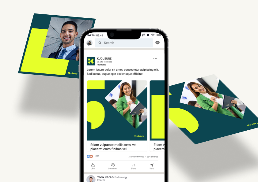
Social concepts combine the same palette and shapes with photography of people. This carries the human part of the proposition into the visual presentation while keeping the mark and colours consistent.
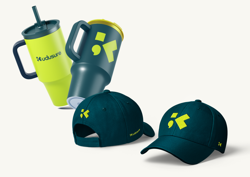
Merchandise concepts apply the identity to caps and tumblers, exploring how the symbol can appear on physical items as well as in communications. These applications are presented as concepts and mockups.
05 / The identity direction
The work established a coherent identity direction: a distinctive K symbol, a defined colour palette and a repeated graphic language across the application concepts. Together, the examples show how KuduSure could introduce itself consistently across professional communications, social creative and physical materials.
Symbol and wordmark in a professional setting.
Photography, colour and graphic shapes.
Caps and tumblers carrying the identity.
06 / Looking ahead
If your business has a complex technical proposition, its identity needs to give people a clear first impression. Speak to FGX about translating your proposition into a visual identity that can work across your communications.
Discuss your brand identity